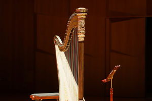
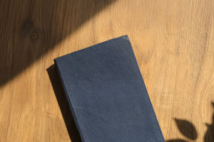
Hi, Readers! In art, what you leave out can be just as powerful as what you put in.
Negative space is the empty area around and between the main subject, and it works a bit like silence in a song. Without that pause, everything turns into noisy clutter.
How Negative Space Gives Art Room to Breathe
In visual art, blank areas are not laziness or unfinished business. They help define edges, guide attention, and give the subject room to stand tall instead of getting lost in a crowded room.
Negative space is often paired with positive space. Positive space is the subject itself, the thing you want people to notice first. Negative space is everything around it. The funny part is that the "nothing" is doing a lot of heavy lifting. It outlines the main form, creates balance, and can even become a shape of its own. Once you start noticing it, you cannot unsee it. It is like realizing the background singer has been carrying the whole chorus.
What Negative Space Does
Negative space helps artists define a subject by carving it out with surrounding emptiness. Instead of drawing every detail directly, an artist can let the blank area describe the object's contour. This makes compositions clearer and often more elegant. It also helps organize visual information, so the viewer's eye knows where to go first, where to rest, and what matters most. In a busy composition, negative space acts like a tidy friend who quietly clears the table before guests arrive.
It also creates contrast. A strong relationship between filled and unfilled areas can make a subject look sharper and more intentional. In some works, the empty area forms a hidden image or second meaning. That is where negative space gets especially clever. A logo, poster, or drawing can hold a visual wink, where the blank part secretly creates another recognizable form.
How It Defines the Subject
When artists use blank space well, the subject becomes easier to recognize because the eye reads the outer edges clearly. Think of it like cutting a shape from paper. You know what the shape is not only from what remains, but also from what was removed. The space around a vase, a face, a tree, or a chair can describe its silhouette with surprising accuracy. Sometimes this works even better than adding more lines or shading.
This approach can also add mood. Wide open areas can make a subject feel calm, isolated, elegant, or dramatic. Tight negative space can create tension or energy. So the blank area is not just helping with form, it is helping with feeling too. It sets the stage without stealing the spotlight.
Ways Artists Use It
Artists use negative space in drawing, painting, graphic design, photography, and logo design. In sketching, one useful method is to draw the empty shapes around an object instead of drawing the object first. That flips the brain into a more observant mode and helps with proportions. In design, generous spacing can make layouts easier to read and more polished. In photography, the empty area around a subject can isolate it and create a stronger focal point.
Minimalist art often relies heavily on negative space because it removes distractions and lets a few carefully chosen elements do the talking. But even detailed work depends on it. Every crowded scene still needs visual breathing room, or the whole thing starts feeling like a closet that refuses to close.
How to Practice Seeing It
A simple way to practice is to look at ordinary objects and study the shapes around them. Notice the gaps between chair legs, the space around leaves, or the outline created by a cup handle. Another exercise is to turn an image upside down and focus only on the empty shapes. That makes it easier to stop naming objects and start actually seeing relationships.
Artists can also experiment by simplifying compositions and removing extra elements. If the subject becomes stronger after something is taken away, that is usually a clue that the negative space is doing its job. Clean spacing is not emptiness for its own purpose. It is structure, clarity, and intention wearing invisible shoes.
In the end, negative space is one of art's sneakiest superpowers. It defines the subject by using absence as a tool, giving form, balance, and meaning to what we see. Next time you look at a painting, poster, or sketch, give the blank areas some credit too. They may look quiet, but they are doing plenty of the talking.